The Challenge
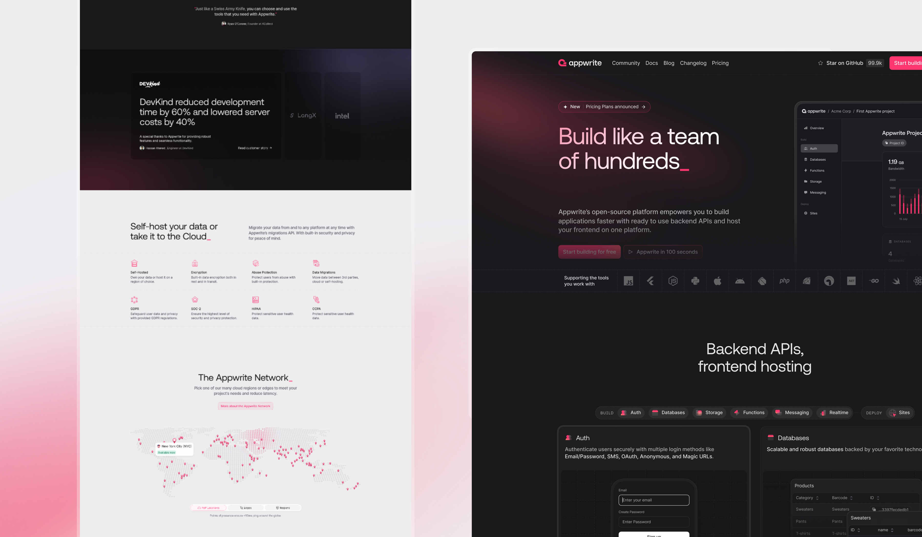
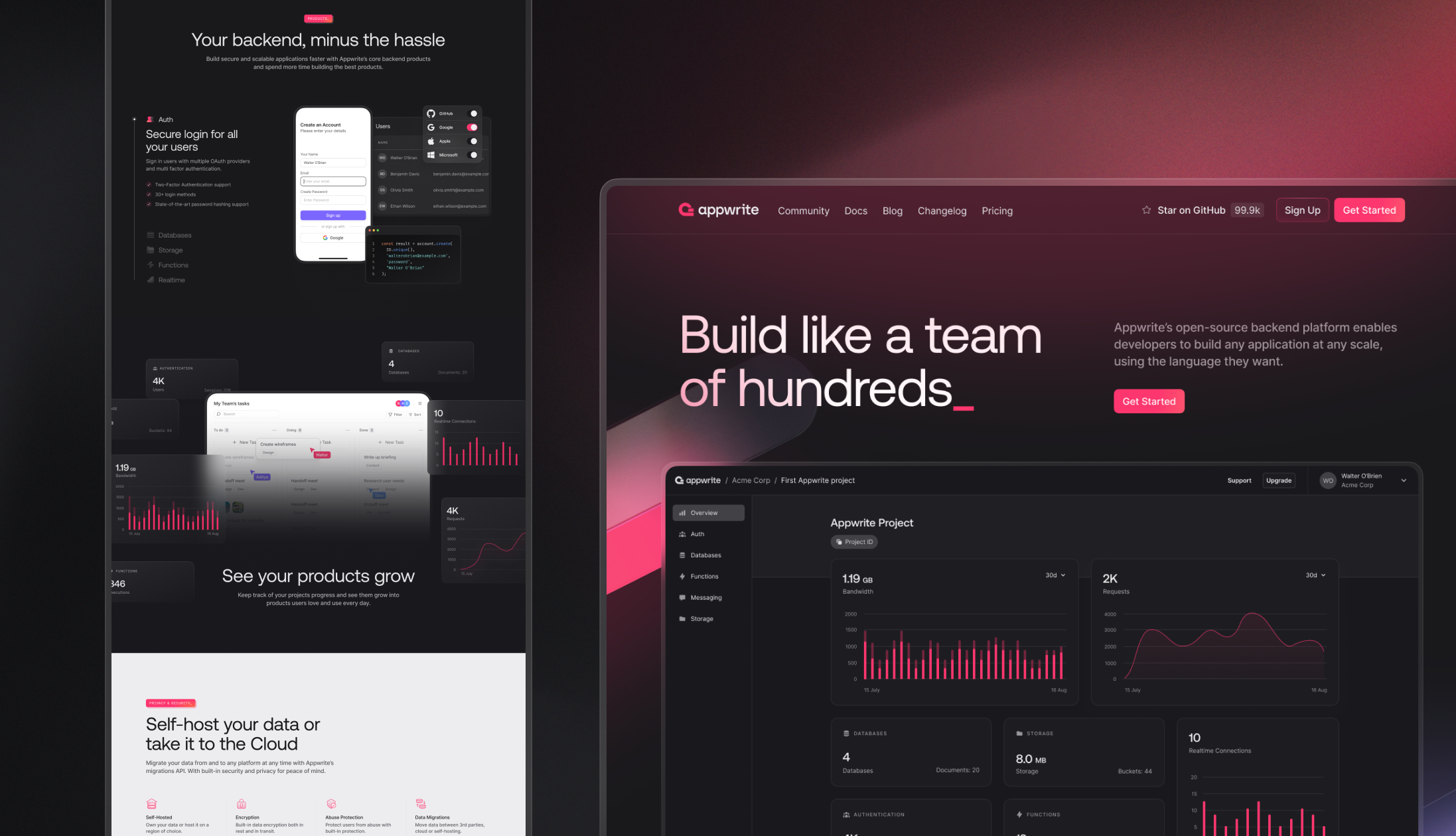
At Appwrite, we've grown from a Backend-as-a-Service into an open-source, all-in-one development platform. With the introduction of our newest product, Sites, we expanded our offering beyond backend services to include hosting. This shift meant our homepage needed to do more, it had to communicate the full breadth of what Appwrite now offers.
Phase 1: Setting the baseline
Before jumping into design changes, we wanted to understand how the homepage was performing. That meant recording baseline metrics and getting fresh insight into the first impression our homepage was giving to new developers.
We ran a qualitative survey with 50 respondents who closely matched our target audience, but who were new to Appwrite.
What we heard
• Positive: People liked the clean layout and visual design. Many said the structure was easy to follow.
• Confusing: Our messaging wasn't clear enough. Some thought Appwrite was a DevOps tool, others a CMS, or just another Firebase clone.
This validated what we suspected: while the design was polished, the story we told wasn't fully landing.
Phase 2: Iterating on the story
Based on those findings, we created a new homepage design in Figma and ran a second qualitative survey—this time on the proposed design with renewed messaging. Next to that, we split tested different hero sections. The results were encouraging.
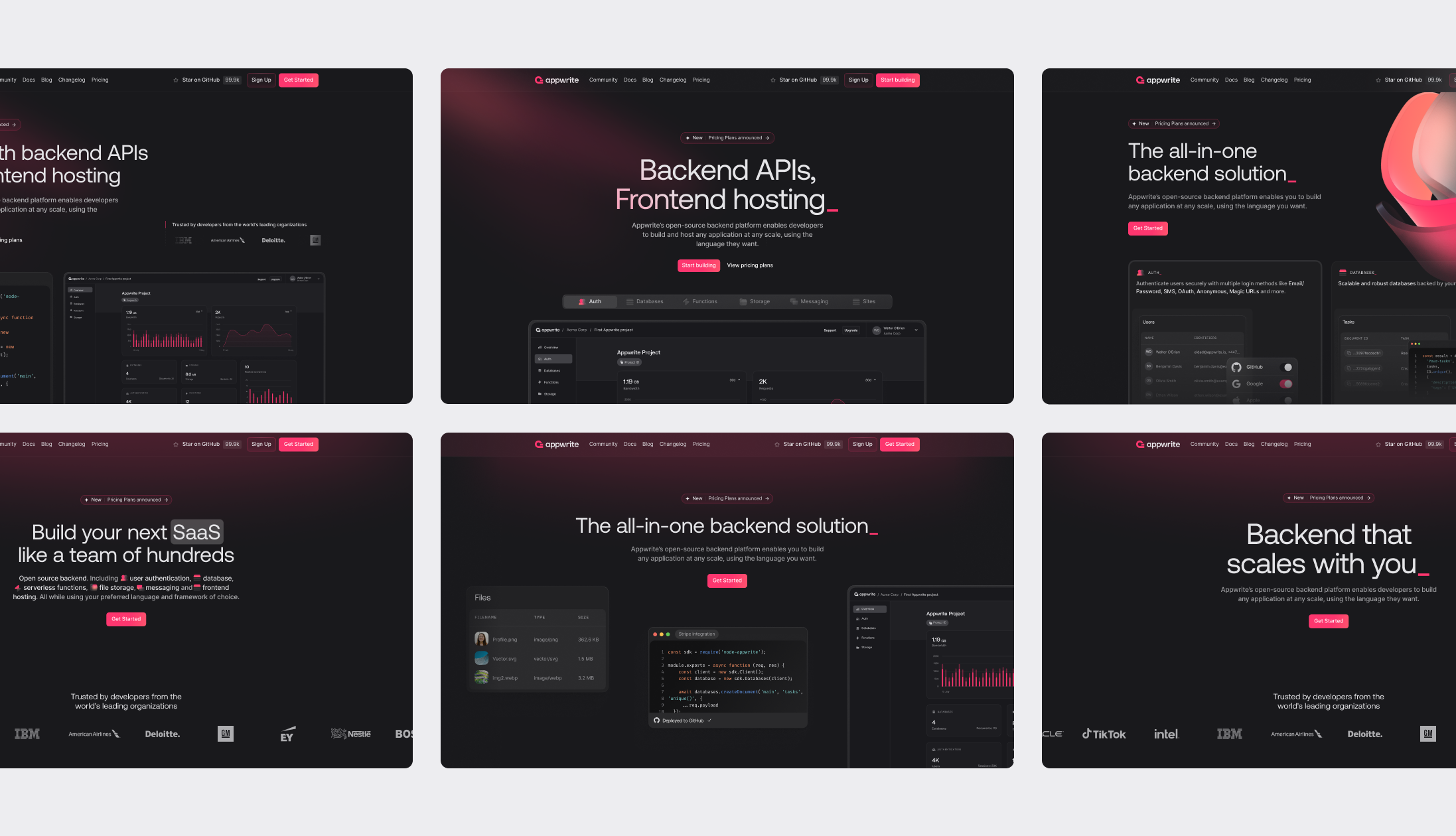
Phase 3: Final design
We simplified our messaging further and focused on showing—not just telling—what Appwrite offers.
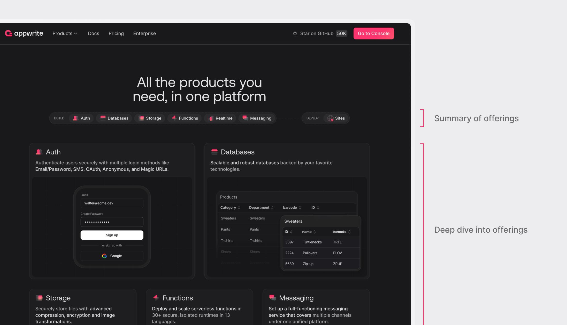
Added components that give a quick visual and conceptual overview of our offering, without requiring visitors to read everything. We honed in on different user behaviors: some people want a fast impression; others want to scroll deep. Our content now supports both.
Repositioned Appwrite from just a BaaS to a complete platform with Sites, our hosting solution, clearly integrated into the story.
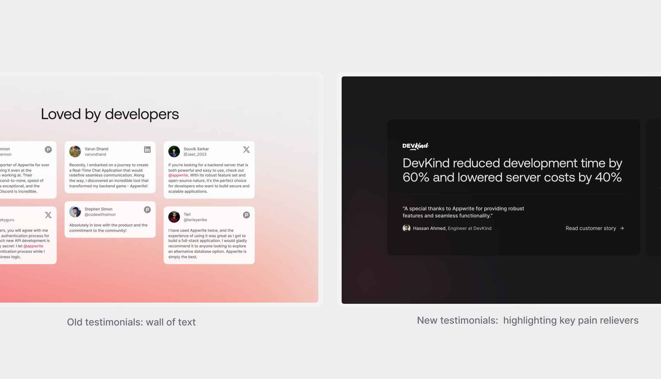
Selected testimonials strategically—highlighting impact metrics like time saved, cost reduction, and scalability, to build credibility with both developers and founders.
User friendly animations
While the main aim was to improve the story that we were trying to convey, we also further improved our visual language. We did a few iterations to further simplify our visuals and worked on an animation style that feels more natural.
In our old page, we had animations based on scroll behavior that slightly hijacked user control—something developers disliked. The new animations and microinteractions make the page feel alive without taking away from the main purpose: understanding the story of Appwrite.
Results
Following the launch of the redesigned homepage, we observed a substantial increase in sign-up conversion. The rate improved from 5.9% to 9.1%, a 54% relative increase compared to the previous version. The new design focused on clearer product positioning, helping users quickly understand the value of the product and move smoothly into the sign-up flow.